When we think of iconic coffee companies, Starbucks is probably the first one that comes to mind. The Seattle-born mega chain has essentially trademarked our morning cup of joe.
And it isn’t just the crowned siren logo that we hold so strongly synonymous with our go-to a.m. drinks — it’s also the color they use: a bright forest green (or as we now call it, Starbucks green).
Everything from the logo, to the cups, and even the store front architecture incorporates this globally recognizable hue. However, where it’s perhaps at its most prominent is on the baristas’ classic aprons.
Ever wonder why they chose green instead of hot pink or maybe an attractive brown, like the beverage for which they’re known? We’ve already explored the history behind the Starbucks’ logo, so now it’s time to delve into the meaning behind Starbucks green.
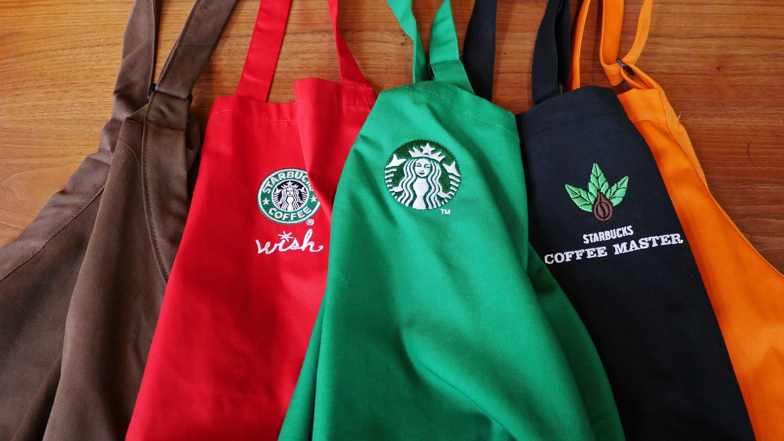
Their aprons weren’t always green, according to a press release on the bean brewer’s site. It started out, similar to their logo, as a brown-hued version in 1971 at their first location in Seattle’s Pike Place Market.
The smock didn’t change colors until 1987, when Starbucks transitioned towards a more European-style coffee shop vibe, including the sale of handcrafted drinks and espresso specialty sips (white shirts, black bow ties, and jazz music included).
Fast forward a few years to 1992 and those crisp, classical, Italian vibes had relaxed into the more recognizable “coffee house genre” of today (sans bow ties).
Aprons were still green, but there was an addition of the Starbucks logo. It was also around this time that the company dropped black-hued aprons into the mix as a way to designate “partners certified in coffee knowledge,” a.k.a. coffee masters.
The different colored aprons that we’ve seen throughout the years (e.g. orange, pale blue, purple, red, embroidered, etc.) have been used to “celebrate events and milestones and recognize partner contributions.”
Although a few hues have been dropped into the mix, the classic forest-colored shade remains the bedrock of Starbucks branding.
We’d venture a guess, though it is unconfirmed by the company, that their Starbucks green hue represents the bright beginnings of a young coffee bean that is ready for the roasting, brewing, and sipping adventures that the future brings.
Elizabeth Buxton


