Neuroscientist Dr. Fabiana Carvalho shares the recent results of a Coffee Science Foundation study, supported by Savor Brands Inc., to understand how packaging color influences consumer behavior. Mary Basco, Research Programs Manager, SCA, talks about her last experience with Dr. Carvalho and Renata Shimuzi with the final, in-person element of this project. Here is what she experienced and her introduction to Carvalho’s study. The full article was published in 25, issue 20 in SCA official website can be found here.
Introduction: how packaging color influences consumer behaviour
by Mary Basco
“In the bustling world of coffee, where first impressions matter just as much as the taste itself, new research is emerging that may very well redefine packaging design. Led by Dr. Fabiana Carvalho, a neuroscientist at the forefront of understanding the complex interplay between design, perception, and coffee enjoyment, the research was designed to unravel the intricate connections between our senses and emotions.
For the first time, this research project, generously supported by Savor Brands LLC., applied learnings in crossmodal perception that we had previously only theorized to the realm of packaging.
Last autumn, I had the unique opportunity to assist researchers Dr. Carvalho and Renata Shimuzi with the final, in-person element of this project.
The work took us to two distinct coffee havens: Rose Park Roasters in Long Beach, California and Black and White Coffee Roasters in Raleigh, North Carolina.
With packaging prototypes in hand, each adorned with a unique hue, we were off to guide eager participants through a meticulously crafted sensory experience.
At each location, we observed how the participants’ eyes would light up with anticipation. They were enthusiastic coffee consumers, eager and curious about this “coffee science.” It was interesting to see them carefully sip their samples and dutifully fill out questionnaires, and even more so to watch them after the testing was complete.
This was when the intriguing interplay between what they saw and what they tasted was revealed; to see revelation dawn upon them and reality sink in was a sight to behold. Many were taken aback by the power that color held over their taste perceptions.
The delicate dance they were drawn into, between packaging and palate, was a waltz of surprise and delight, as the coffee they thought they knew so well surprised them.
It was a treat to be in earshot of the excited chatter of participants after each round of testing. They exchanged anecdotes about their own relationships with coffee and discussed their newfound sensory awareness.
It became clear—to them and to me—that this transcended their habitual coffee-drinking experience, elevating it beyond the ordinary to the extraordinary.
I discovered that multisensory research on coffee product packaging was more than just science; it was an exploration of the human connection to the beverages we hold dear. The experiences we shared at Rose Park Roasters and Black and White Coffee Roasters have transformed the way I perceive coffee, opening my eyes to the symphony of senses that lay dormant within each cup.
As the scientific community eagerly awaits the publication of their comprehensive research, the coffee industry should be buzzing with excitement.
The results presented herein suggest that sensory cues can influence perception, intensifying the anticipation of flavor and appreciation of the coffee in the package.
Furthermore, the possibility for more multisensory research truly holds the promise of elevating coffee packaging to an art form, where each bag becomes a canvas for sensory exploration. Whether you’re a casual coffee enthusiast or a connoisseur, the way you perceive and savor your favorite beverage is on the cusp of a transformative sensory revolution.
Over time, the function of food packaging has moved far beyond its original role of maintaining freshness and quality of the product inside.
The summarized research by Dr. Fabiana Carvalho coauthored by Renata Shimuzi
Even as far back as the 1960s, packaging was already seen as a “silent salesman” with huge potential to convey sensory and symbolic characteristics of the product. [1] Product packaging is, in itself, a multisensory object: it has its own multisensory attributes which include color, shape, size, sounds, and haptics,[2] but also graphic elements such as typography and logotype.
All these attributes can affect how the packaging stands out on the shelf and, consequently, influence consumers’ behavior. Moreover, these multisensory attributes may not only set consumers’ expectations towards the product but can also affect the actual perception of the product itself.[3]
Humans, as a species, are visually dominant: the size of the human cortex devoted to processing visual information is larger than the cortices processing any other sensory modality. This means that the visual characteristics of packaging play a major role in capturing consumers’ attention.
Within the range of possible visual cues, color is the most important of all: a 2006 study claims that color drives 62–90 percent of all consumer purchasing decisions.[4] Beyond capturing a consumer’s attention, packaging color can also be used to communicate the attributes of the product inside, known as “crossmodal correspondence,” or as a kind of crosstalk between the senses.
People tend to share surprising cross-sensory associations between apparently unrelated attributes from different sensory modalities. For example, certain colors are perceived as belonging together with certain tastes or flavors: “black” and “brown” are usually paired with bitterness; “yellow” is paired with acidity and citrus notes; and “pink” is paired with sweetness and red berry notes.[5]
Across multiple research studies, the importance of crossmodal congruence among the design elements of a package and the characteristics of its content has now been well-established.[6]
Would this color-flavor crossmodal rationale apply to specialty coffee packaging? In 2019, our research group investigated whether the color (pink or green) of packaging labels would influence sensory and hedonic (preference or liking) judgments of specialty coffee by consumers,[7] and found a primary effect of color on taste expectation.
In other words, the colors pink and green increased consumers’ expectations towards sweetness and acidity levels of the coffee served, respectively.
Last year, the same research group, in collaboration with the Coffee Science Foundation and Savor Brands, had the opportunity to further explore the impact of packaging color on consumers’ judgement of the coffee inside—we wanted to test difference in color “hue” (i.e., the “pure range of colors” and their associated pigment on the color wheel) and “saturation” (i.e., the intensity or dominance of a specific hue)[8] on US specialty coffee consumers.[9]
Hue, saturation, and expectation: an online survey
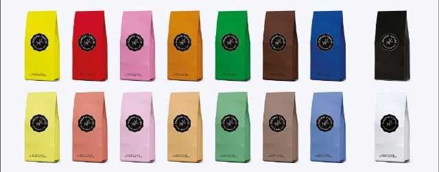
The first experiment was conducted online: a total of 238 consumers were presented with images of coffee bags on the screen of their mobile phones and were asked to report their expectations of several sensory, hedonic, symbolic, and utilitarian attributes[10] of the coffee. For this first study, we used seven different hues (yellow, red, pink, orange, blue, green, and brown—plus black and white) and two saturation levels (100% or “high” and 50% or “low”).
The results revealed that both hue and saturation affected consumers’ expectations of the sensory attributes: compared to all other hues, the coffee from the yellow bag was expected to be most acidic; coffee from the pink bag was expected to be the sweetest. In addition, the coffees from both yellow and pink bags were also expected to have the lowest intensity levels of bitterness, body, and roast level.
The opposite effect was observed for the coffee from the brown and black bags: they were expected to be the least acidic and sweet, and were expected to have the highest intensity levels of bitterness, aroma, flavor, body, and roast level.
In exploring the impact of saturation alone, high saturation bags were associated with higher intensity levels of coffee bitterness, aroma, flavor, body, and roast level than the low saturation bags.
When the consumers were asked about their expectations of liking the coffees from the colored bags, higher liking ratings were observed for low saturation bags (compared to the high saturation ones) and the lowest liking ratings were given to the brown bag (compared to all other hues).
We also observed that certain colors were significantly associated with certain flavor profiles as well as symbolic and utilitarian concepts. For example, the yellow bag was associated with “citrus”; the green one with “herbal”; and the brown and black bags with the darker flavor notes such as “brown sugar,” “roasted nuts,” “cocoa,” and “spicy.” Survey respondents also associated the black and red bags with the word “commercial,” the green bag with “organic,” and the yellow and pink bags with “modern.”
As hypothesized based on the previous literature, the color of the bag exerted a significant crossmodal effect on the expectation of sweetness, acidity, and bitterness. Darker versus lighter colors, such as brown and black versus yellow and pink, also impacted the expected intensity of several coffee attributes such as aroma, flavor, body, and roast level. Based on the results from the online study, we selected the hues that had the most opposite effects on virtually all tested attributes—pink and brown, in both high and low saturations—as the focus of our second experiment.

Impact of Hue and Saturation on Taste Perception
In the second experiment, a total of 226 consumers were presented with actual 12oz coffee bags in a 2 × 2 factorial design (2 hues: pink and brown; 2 saturation levels: low and high). For the sake of keeping the length of each tasting session to no more than 30 minutes, half of the consumers were exposed only to the low saturation bags and the other half only to the high saturation bags (this is known as a “split plot” design). The participants were served the same drip coffee[11] as samples, paired with or without the coffee bags depending on the test condition.
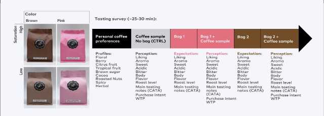
The sessions were conducted in quiet, well-lit, and air-conditioned testing rooms at Rose Park (Long Beach, CA) and at Black & White Coffee Roasters (Raleigh, NC). To assess their individual preferences, before the start of a tasting session participants were asked to rate how much they liked a series of general flavor profiles, so that later we could also determine if these preferences played a role in their responses.
The tasting session started by serving participants with a “blind” coffee sample (i.e., not served in relation to any coffee packaging, as a control condition) and asking them to evaluate a series of sensory attributes, either using intensity scales (0–10) or selecting general flavor descriptors from a list.
They were also asked how much they liked the coffee and how much they would be willing to pay for a 12oz bag of that coffee.
Then, participants were presented with the first coffee bag and asked to report their expectation of the coffee’s sensory attributes, based on its packaging. Afterwards, participants were served a second coffee sample, with the “bag” of coffee brewed placed directly in front of them.
They were asked to taste the coffee and report their actual perception of the coffee from this first bag, evaluating the same sensory attributes.
Then, they answered the same questions about liking and willingness to pay for the sample presented alongside the first bag, just as they did for the control coffee. This double process (expectation assessment then perception assessment) was then completed for a second coffee bag.
Which were the most relevant results of this second experiment? We once again observed a significant impact of hue on expectation of sensory attributes as well as hedonic and purchase measures—but this time, we also noticed that hue impacted participants’ perception, too.
First, we observed a large difference between the expectation of all sensory attributes triggered by the bag color. The pink bag was associated with the expectation of higher sweetness and acidity, and lower bitterness, aroma, flavor, body, and roast level when compared to the brown bag.
Moreover, respondents were more likely to report expectations that the pink bag contained coffee with tropical fruit, floral, and berry notes and that the brown bag contained coffee with spicy, brown sugar, and cocoa notes.
Interestingly, many of the expectations primed by the bag color carried over to influence participants’ actual perception of the coffee sample. The coffee paired with the pink bag was perceived as being sweeter, and as having more flavor and body than the control coffee sample presented without a bag. The coffee paired with the brown bag was perceived as having more aroma, flavor, and body as well as a darker roast level than the control coffee, and more body and a darker roast level than coffee from the pink bag.
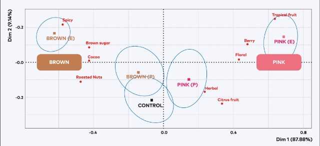
An interesting pattern emerged when looking at the perceived flavor notes in the three coffee samples (i.e., control, pink, and brown): participants’ perception of coffee associated with a bag, either pink or brown, was clearly impacted by their prior expectation of each coffee sample, primed by color. In Figure 4, despite both pink and brown coffees being perceived as closer to the control coffee, when mapped they are still separated by the first dimension of the plot. In other words, the “pink coffee” perception is located on the right half whereas the “brown coffee” is on the left half.
Moving on to the liking and purchase behavior results, a cluster analysis based on consumers’ prior preferences of coffee flavor profiles revealed three main consumer groups. The first group, called Cluster 1, was composed of the consumers with high preference for coffees that have fruity notes (such as citrus, berry, and tropical) and low preference for coffees that have brown notes (such as caramel, roasted nuts, and cocoa).
The third group of consumers, called Cluster 3, showed the opposite preference: high preference for brown-note coffees and low preference for fruity coffees. Finally, the cluster in the middle, called Cluster 2, was composed of consumers having high preference for both fruity and brown-note coffees.
The cluster membership was then used to understand liking. We observed that the consumers from Cluster 1 have a high expectation of liking the coffee from the pink bag and a low expectation of liking the coffee from the brown bag; the opposite was observed for the consumers from Cluster 3. During coffee tasting, consumers from Cluster 1 reported that they preferred the coffee sample they believed to be from the pink bag.
Regardless of cluster membership, study participants reported they would be more willing to pay for the coffee in a pink bag (i.e., the pink bag added more perceived value for all the participants)—even for those who explicitly reported disliking fruity coffees! Moreover, we also observed that consumers from Cluster 1 were willing to pay more for any coffee served to them, not only the one associated with the pink bag, which they reported as having liked more.
Results from both experiments show that packaging color is a substantial part of the experience of buying and consuming specialty coffee. It impacts not only their expectations but also their perceptions—across a wide range of potential different attributes (modern to commercial, sweet to bitter, citrusy to chocolatey)—and even when the very same coffee is served to them.
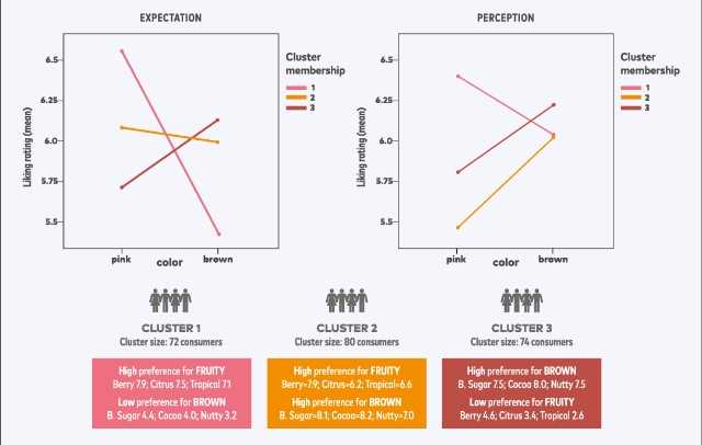
Fascinatingly, we also observed that acidity seems to be the main flavor attribute dividing consumers’ preferences. On one hand, a group of consumers had a very high preference for coffees with fruity notes, which tend to have a sour–sweet overall profile, and rejection of the brown-note coffees, which tend to have low levels of acidity (and might also present a bit of smooth bitterness).
On the other hand, another group of consumers rejected the acidic/fruity coffees and showed a very high preference for the brown–sweet overall profile. Ultimately, however, our results suggest that coffees assigned as fruity were perceived as having more value. The exact same coffee perceived as “fruity” when paired with the pink bag, instead of being perceived as “brown sugar” when paired with the brown bag, was worth more money according to the consumers, regardless of their preference”.
References
[1] James Pilditch, The Silent Salesman: How to Develop Packaging that Sells (London, UK: Business Books, 1961).
[2] “Haptic” communication is the transmission and understanding of information through physical touch. You have most likely encountered this more recently if you’ve adjusted the vibration settings on your mobile phone or a game console controller, but packaging— the smoothness or roughness of a bag or label, or the texture of an accompanying informational card—also features haptic information.
[3] Betina Piqueras-Fiszman, Carlos Velasco, and Charles Spence, “Exploring implicit and explicit crossmodal colour–flavour correspondences in product packaging,” Food Quality and Preference 25, no. 2 (2012): 148–155.
[4] Satyendra Singh, “Impact of colour on marketing,” Management Decision 44 (2006): 783–789.
[5] Charles Spence, “On the psychological impact of food colour,” Flavor 4, no. 1 (2015): 1–16.
[6] Piqueras-Fiszman et al. (2012): 148–155.
[7] Maísa M. M. de Sousa, Fabiana M. Carvalho, and Rosemary G. F. A. Pereira, “Colour and shape of design elements of the packaging labels influence consumer expectations and hedonic judgments of specialty coffee,” Food Quality and Preference 83 (2020): 103902.
[8] Learn more about hue and saturation: https://learn.leighcotnoir.com/artspeak/elements-color/hue-valuesaturation/.
[9] In order to participate, study participants had to: (1) live in the US, (2) be an amateur coffee consumer (as opposed to working in the coffee industry), (3) have been drinking black/pure specialty coffee for at least a year (filter or espresso), (4) have a frequency of consumption of specialty equal or more than 5 days per week, and (5) have normal color vision.
[10] Sensory: Aroma, flavor, sweetness, acidity, bitterness, body, and roast level (0–10 intensity scale); association with general flavor profiles “citrus fruits,” “berry fruits,” “tropical fruits,” “floral,” “herbal,” “roasted nuts,” “cocoa,” “brown sugar,” “spicy” (Check-All-That-Apply); Hedonic: Liking (0–10 intensity scale); Symbolic: Association with the terms “modern,” “sophisticated,” “commercial” (Check-All-That-Apply); Utilitarian: Association with the terms “organic,” “decaf” (Check-All-That-Apply).
[11] Coffee: Gamatui Community, Sipi Falls, Uganda, washed, SL varieties, 1600–1900 masl, cupping score 85, cupping notes: red fruits and brown sugar, provided by Black & White Roasters; Preparation: 125 grams of coffee for 1,700 grams of brewed beverage ground at 17 on EK43, TDS ~1.5 | Extraction 20.4%; Service: ~80mL at 64.7°C (±0.7) in identical white porcelain cups.


