MINDEN, Germany – Melitta Professional is presenting a revised corporate design from this September. The core element and aim of the more sharpened approach is to further increase the visibility of the Melitta Group company’s concentration on commercial customers in the out-of-home market. This aspiration manifests itself not least in a new company logo. The new brand identity will be rolled out gradually across all communication channels and the entire product portfolio. It will be implemented in every market across the world.
For over 100 years, Melitta has been synonymous with the enjoyment of perfect coffee. In the out-of-home sector, Melitta Professional has been a successful provider of fully integrated solutions for decades. Not just in Germany, but increasingly also internationally. Melitta Professional already generates more than 70 percent of its sales outside of Germany now.
“Independence, high quality standards and our origins as part of the strong Melitta Group – all of that is integral to Melitta Professional,” explains Managing Director, Marco Gottschalk, and emphasises: “Together with our partners, we are looking forward to increasing the visibility of the enhanced Melitta Professional brand and our services on the market and expanding our market position.”
Clear, stimulating, concise – Melitta Professional ‘s design and logo
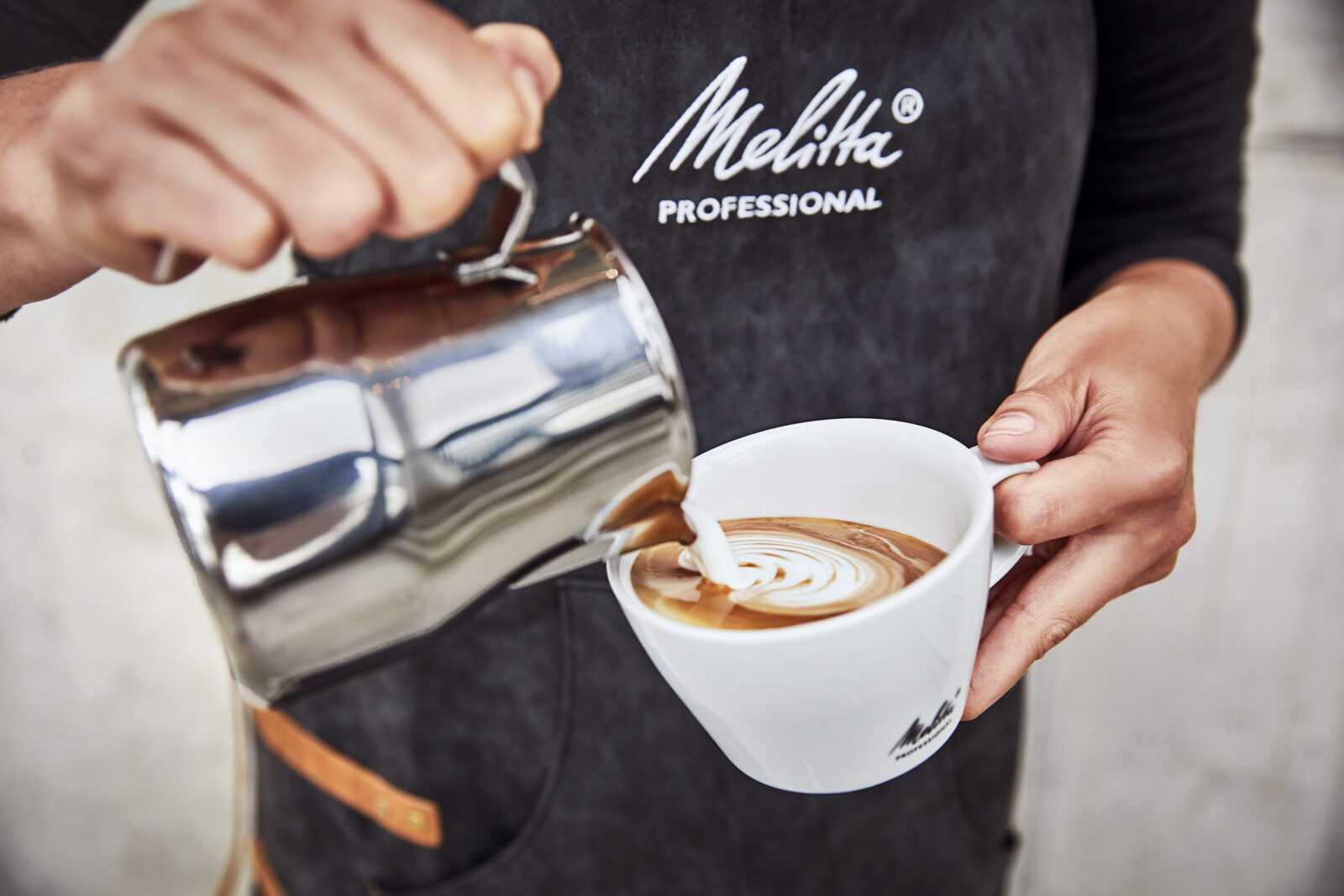
The new corporate design with new colours, clean lines and an autonomous word and figurative mark “Melitta® PROFESSIONAL” combines the umbrella brand of “Melitta” with the company’s expertise in working with “Professionals”, sharpening the unique role that Melitta Professional has on the market. The typical Melitta lettering has been retained in the new company logo, which will also be gradually replacing the Melitta brand logo (white Melitta lettering on red flag) on Melitta Professional products.
However, the familiar brand logo will not be disappearing altogether: wherever it makes sense to integrate it into a particular medium, the red Melitta flag will still feature as a finishing touch; by no means dominant but at a respectful distance from the company logo and standing on its shorter side. The trick here is that Melitta Professional products can also be identified by the addition of the Melitta flag in a vertical orientation. The flag therefore becomes a label and a mark of quality.
The new logo is the set element of the new design, a sign of quality for partners and their guests. Light colours may be used on dark backgrounds as well as dark on light. Both parts of the word and figurative mark, Melitta and Professional, must always be in the same colour.
However, the logo is never used on its own. A specific medium can only be counted as a Melitta Professional product if it has a red accent. The vertical flag is not a must; wherever its use makes no sense or is impossible, it is replaced by a red accent, which should preferably fulfil a purpose, rather than just being a purely decorative element. Typical examples of this are the handle on a coffee pot, wing mirrors on a vehicle, the coloured edge of a business card, or the protruding inner wrapping of a packaged product.
Enhanced showcasing of strengths
The new corporate design will be integrated gradually over the next few months. A major part of this is the redesigned website, which has been available to view in every country since the beginning of September. In the reorganised and newly created sections, the company not only describes its comprehensive product portfolio for fully-integrated solutions in the out-of-home market – coffee, coffee machines, technical customer service, digital solutions and finance – but also provides an insight into the underlying expertise.
For example, coffee machine technology, the coffee machine production facilities in Minden, coffee expertise from Melitta, customer service and the infrastructure for digital services. Melitta Professional has also given the subject of sustainability a special place on their website. “With our new website, we are emphasising the dynamic development at Melitta Professional and giving all the facets of our unique portfolio the space they deserve. The new corporate design creates lots of different opportunities for enhanced showcasing of our strengths as a fully-integrated solution and system provider,” reports Markus Reinhardt, Head of Market Activation, Digital Products and Solutions at Melitta Professional.
Strong design partner
The strong design partner at Melitta Professional’s side is the Gruppe für Gestaltung from Bremen. “In GfG, we have a team by our side who have already developed various projects with charisma for the out-of-home market in the past and played a major part in our successful relaunch with their creativity and dedication,” comments Managing Director, Marco Gottschalk. Björn Voigt, General Manager of Gruppe für Gestaltung: “Close teamwork was on the agenda right from the start when working with Melitta Professional. The principle of working on an equal footing with mutual respect contributed greatly to the success of the comprehensive redesign.”


