RICHMOND, Victoria, Australia – Veneziano Coffee Roasters is bringing a fresh new look to their well-known coffee line up. “We’ve had the same brand identity and packaging for coming up to 5 years now and as we well know, the coffee industry is dynamic and changing rapidly.
Daily in our business, we seek to find new ways to maintain a fresh approach to what we do, to challenge our status quo and do things better. Our look and feel is no different.” Said Veneziano Managing Director, Craig Dickson.
Veneziano approached this brand refresh, or evolution as they like to call it, by cementing a strong brand strategy first, before attacking anything from a visual or creative perspective.
“It was critical we spent time understanding who we are, our purpose and what make us different from our competitors, before we started playing around with our visual identity. What we uncovered was that our experience, our talent and our access to resources means we can make significant positive impacts on the lives of our customers and the producers that we source coffee from. In short, we can make a real and substantial difference to the specialty coffee industry as a whole, and we thought that was a really special thing” said Craig.
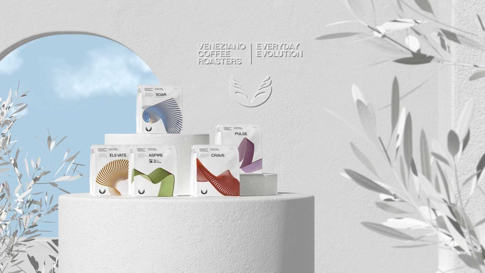
Veneziano’s new visual identity speaks to their new brand essence – Coffee with Significance – with their hero message Everyday Evolution. With small and consistent changes in what we do day to day, we can collectively continue to strive towards coffee with significance.
For the first time in their 20-year history, the Veneziano blends have undergone a name change to support the new strategy. While the former names hold a very special place in the teams’ heart, lovers of their blends need not worry, the blend composition and quality has not changed – the same blends you love remain exactly the same.
Veneziano’s range will now be known as: Crave, Elevate, Pulse, Aspire and Soar. All names evoke a sense of movement, action and evolution. Their hero microlot range has undergone a makeover too, where the country of origin is celebrated by use of colour and map graphics.
“We want to place more emphasis on the amazing coffee producers and communities we work with, to showcase their meticulous work at origin to bring us the coffee we love.” Said Craig.
The Veneziano logo has been treated with small visual updates, including a custom designed typeface. The wings, however, remain intact and the core identifying marque of the Veneziano brand.
“Our logo has built up equity over the years and is well recognised across the industry. This evolution was not about changing for the sake of change, but about adding layers of depth to our brand to give us more flex in a rapidly changing marketplace.”
“We’re very excited about what the next phase holds for Veneziano. We have grand plans and know that this evolution will hold us in great stead to add more value to our wholesale customers, to welcome more to the family and to grow our presence in the retail market”, said Craig. Veneziano partnered with design agency Pop + Pac, located in Collingwood, Victoria to bring to life the new strategy over a 12-month journey. Pop + Pac are renowned for their work in the design space, in particular in the hospitality and specialty coffee industry.


